Kitchen cabinets do more than hold dishes and pantry staples. They set the tone for the entire room, influence how light moves through the space, and shape how modern a kitchen feels over time. Color combinations matter because they affect mood, upkeep, resale appeal, and the way everyday routines feel in a busy home.
Soft Neutrals With Warm Wood
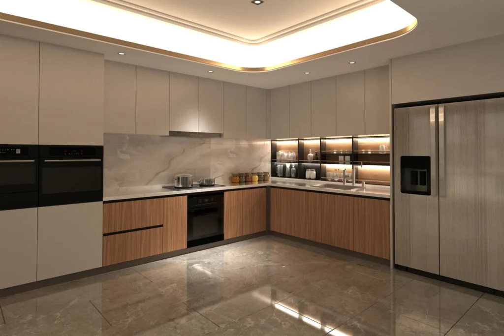
One of the most enduring directions in modern kitchen design is pairing soft neutrals with natural wood tones. White, ivory, taupe, and pale gray create a clean backdrop, while oak, walnut, or ash adds warmth and texture. This balance works well because it avoids the flatness that can happen when a kitchen relies on a single tone.
The National Kitchen and Bath Association has long reported that white and light neutrals remain among the most commonly requested kitchen cabinet finishes, which makes sense in spaces that need to feel bright and adaptable. Wood accents also help modern kitchens avoid feeling cold, especially in homes that use open layouts and lots of hard surfaces. A neutral-and-wood pairing tends to age well because it complements changing wall paint, flooring, and decor choices.
Deep Navy With Crisp White
Navy and white remain a classic combination for modern cabinets because the contrast feels sharp without becoming harsh. A deep blue base brings depth and a grounded look, while white uppers or surrounding surfaces keep the room open and airy. The result feels polished and current, especially in kitchens with plenty of natural light.
Design surveys from major paint and kitchen organizations consistently place blue among the most popular cabinet color families, and navy is often favored for its ability to feel both traditional and modern. This pairing is especially useful in medium or larger kitchens, where darker lower cabinets can anchor the room. It also works nicely with brushed brass, matte black, or stainless hardware, depending on how bold or restrained the overall style should feel.
Charcoal With Pale Oak
Charcoal cabinets paired with pale oak create a modern look that feels balanced and practical. Dark gray adds a sleek edge, while light wood softens the overall effect and keeps the space from feeling heavy. This combination is especially appealing in kitchens with minimal ornamentation, flat-panel doors, and simple hardware.
Dark cabinet finishes have become more common in contemporary homes because they hide everyday wear better than highly reflective surfaces, though they can show dust more readily than medium tones. Pale oak brings visual relief and warmth, which matters in kitchens that need to feel welcoming rather than industrial. The contrast also helps define zones in an open-plan layout, especially when cabinets extend into a dining or living area.
Sage Green With Cream
Sage green has become a popular cabinet color because it feels calm, natural, and easy to live with. Paired with cream, it creates a softer contrast than pure white, making the kitchen feel relaxed instead of stark. This combination works particularly well in homes that want a modern look without leaning too cold or overly formal.
Green cabinetry has strong staying power because it connects easily with plants, stone surfaces, and natural textures. Benjamin Moore and other major paint brands have noted the steady popularity of muted greens in recent color trend reports, and sage often leads because it feels familiar and fresh at the same time. Cream uppers or walls help reflect light, which is useful in kitchens that do not get much sun during the day.
Black With Natural Wood
Black and wood is one of the strongest modern pairings for cabinets because it mixes contrast with comfort. Matte black lowers or an island can bring definition and drama, while wood keeps the room from becoming too severe. The combination works especially well in kitchens with simple layouts, slab doors, and minimal decorative clutter.
This pairing is common in modern and Scandinavian-inspired spaces because it relies on material contrast rather than excessive ornament. The black surface gives a clear visual anchor, while wood grain adds movement and a sense of quality. In practical terms, darker cabinets can make fingerprints less obvious than high-gloss finishes, though lighting should be planned carefully so the kitchen still feels open and usable.
Greige With White
Greige, a mix of gray and beige, paired with white cabinets or walls offers a quiet modern look that feels flexible in many homes. It sits comfortably between warm and cool, which makes it useful when the rest of the kitchen includes mixed materials such as stone counters, tile backsplashes, and metal accents. The overall effect is calm and tidy.
Industry color trend reports often highlight greige because it bridges older beige-heavy styles and newer gray-led designs. That makes it appealing for renovations where the goal is a refreshed look without making the room feel overly trendy. White upper cabinets or trim can keep the space bright, while greige lowers or an island add just enough depth to define the layout.
Olive Green With Matte Black
Olive green and matte black create a more grounded modern palette that feels rich without needing bright contrast. Olive has enough warmth to soften the black, and the black gives the green a tailored edge. This pairing works best when the room has natural textures, simple lighting fixtures, and uncomplicated cabinet profiles.
Earth-toned palettes have grown in popularity as more homeowners favor kitchens that feel connected to nature and daily life rather than overly polished. Olive cabinets can also hide minor imperfections better than very pale finishes, which matters in high-use areas. Matte black hardware or accents keep the look unified and help the space feel intentional rather than busy.
White With Soft Gray
White and soft gray remain one of the safest modern combinations because they feel clean, bright, and easy to adapt. White cabinets or uppers make the room feel larger, while gray lowers, an island, or perimeter cabinets create subtle structure. This pairing is especially effective in kitchens that need to support changing decor over time.
According to color preference surveys from major home paint brands, light neutrals continue to rank highly because they offer flexibility and broad visual appeal. Soft gray brings just enough contrast to prevent the kitchen from feeling flat, but it still avoids the heaviness of darker tones. This makes the combination useful in compact kitchens, rental updates, and family homes where simplicity matters.
How Lighting Changes Color
Cabinet color choices never stand alone, because lighting can dramatically change how every finish reads. Natural daylight tends to make whites look cleaner and blues or greens more vivid, while warm evening lighting can pull out beige, yellow, or red undertones. The same cabinet sample may look very different from one room to another, which is why testing in the actual space matters.
A kitchen with north-facing light often benefits from warmer cabinet colors such as cream, greige, or natural wood, while a sun-filled room can handle deeper shades like navy or charcoal with less risk of feeling dark. LED lighting also plays a role, since color temperature can shift the appearance of paint and finish. The U.S. Department of Energy notes that lighting quality strongly affects how spaces are perceived, and kitchens are especially sensitive because they blend task lighting with ambient light.
Hardware And Countertop Pairings
Cabinet colors feel more complete when they work with hardware and counters instead of competing with them. Brass tends to warm up cool cabinet colors, black hardware sharpens light cabinets, and stainless steel often supports a more practical modern look. Countertop materials matter too, since busy stone patterns can overpower cabinet color if the palette is already strong.
A simple rule used by many designers is to let one surface lead while the others support it. For example, bold navy cabinets often pair best with quieter counters, while white or greige cabinets can handle more visible stone movement. This approach keeps the kitchen from feeling crowded. It also makes maintenance easier, because the room appears organized even when everyday items are out on the counter.
Choosing A Combination That Lasts
The best cabinet color combination is usually the one that fits both the architecture of the home and the rhythm of daily use. A bright, airy kitchen may suit white and gray better, while a kitchen that needs warmth may feel better with wood and cream. Since cabinets are among the most visually dominant features in a kitchen, the color choice influences the whole room for years.
The most durable combinations tend to share a few traits: balanced contrast, practical lighting, and finishes that do not depend too heavily on a passing style. That is why neutral-and-wood pairings, navy and white, and greige-based palettes continue to appear in kitchen design reports year after year. Kitchen and bath industry guidance, along with paint brand color trends, points to the same idea: the most successful combinations are the ones that feel comfortable in real life, not just in a showroom. A good palette supports cooking, gathering, cleaning, and everyday movement without demanding constant attention. It also gives the home a sense of calm that lasts beyond the first impression.